The Starting Point: Climate over the last 1000 years
Probably the most famous image from this whole debate is the "Hockey Stick" graph, showing what was said to be the climate over the last 1000 years:

This was from a 1999 paper by Michael Mann (and co authors Raymond Bradley and Malcolm Hughes; this paper is often referred to as MBH99 after the author's initials and publication date). When I first saw this, I was pretty skeptical. It showed a stable climate (notice how flat the blue line is over most of the time?) until very recently followed by a sudden spike in temperature - a long flat line with a sudden right-hand hook looks like a hockey stick (hence the name of the graph).
We didn't hear much about an impending heat death of the globe until fairly recently. Before the late 1990s, the current scientific consensus was that climate fluctuated, sometimes hotter and sometimes cooler. The current climate was not seen as being particularly warm - certainly less warm that the Medieval period (called the "Medieval Warm Period", or MWP) or the Roman era (called the "Roman Climate Optimum"). This was all written up in the first Assessment Report from the UN Intergovernmental Panel on Climate Change (IPCC) which periodically published the latest and best scientific understanding on the issue. Page 202 of that report showed the scientific consensus of climate history over the last thousand years.

You can see the MWP of the left, the "Little Ice Age" where famine ruled Europe in the middle, and then a temperature recovery to the current era on the right. No hockey stick to be seen anywhere. Remember, this was the scientific establishment view in 1990.
As it turns out, there's plenty of history to support this establishment view, and which disputes the MBH99 hockey stick. The Domesday Book was a tax survey compiled by William the Conquerer after he invaded England in 1066. It detailed everything in his kingdom that was worth taxing, and so it was assembled with care. It documented wine vineyards in the north of England, far to the north of where wine is produced today, implying that the climate was warmer in 1066 than it is in 2017. There is excellent documentary history that the MWP was followed by a catastrophic cooling - the Little Ice Age: as todays's glaciers retreat, archaeologists have discovered the remains of alpine villages that were overrun by glaciers. And recently, the Vatican announced changes to centuries-old prayers to stop the advance of the glaciers.
The important point here is that there is quite a lot of recorded history from the period that does not square with the climate reconstruction from the Hockey Stick paper. As it turns out, the MBH99 paper has been conclusively debunked: the data sets used were inappropriate and the statistical algorithms were "novel" (the produced hockey stick shaped output even on completely random data; for example, if you ran the numbers from the telephone directory through the algorithm it would give you a hockey stick).
How do we know what the temperature was 1000 years ago?
The thermometer was invented in the early 1600s. The oldest regularly maintained series of readings are from the Central England Temperature (CET) series that dates to 1659. So how do we know what the temperature was before that? Proxies.
A proxy is a measurement that isn't directly a temperature measurement but which maps to what we think the temperature was. The most famous of these are tree ring widths: rings will be wider in warmer years when growth is faster, and narrower in cold years when growth is slower. There are a lot of other types of proxies: rings showing growth in coral reefs, layers of sediment from ponds, and most interestingly, layers of ice deposited on glaciers. Drilling into the glacier results in ice cores which have annual accretions - colder years will have thicker layers and warmer years will have thinner ones.
Proxies reflect temperature and some of these records go back a very, very long time. The Greenland Ice Core Project (GRIP) ice cores date back thousands of years:

The Vostok ice cores from Antarctica go much further back, hundreds of thousands of years:

You can see the alteration between ice ages (populated by Woolley Mammoths and other cold weather fauna) and warm inter-glacial periods. We are currently in one of those interglacials. It's unclear what caused the ice ages, and what caused the warmer inter-glacials. However, man-made carbon dioxide is not one of the plausible theories for the interglacials.
The Greenhouse Effect
OK, so we know that climate has been up and down for pretty much as long as we can piece together records. Rather than history, what's going on right now?
We now need to shift from history to Chemistry. We've heard of the "Greenhouse Effect", where sunlight passes through the atmosphere to the ground, the energy is absorbed and re-emitted as heat, and the heat is trapped by the atmosphere. In more precise scientific terms, certain gases are transparent to visible light, but obaque (blocking) to heat (infrared) radiation.
Carbon Dioxide (CO2 is one of a set of greenhouse gases, including methane and water vapor. One justification for the Hockey Stick that proponents of AGW theory used was that the Industrial Revolution began to produce large amounts of CO2 around 1850, which is when we saw the spike in temperature. There are a couple problems with this:
1. Correlation does not imply causation. Just because something happens at the same time as something else, doesn't mean that it's caused by it. If we see a big increase in, say, the number of lemons imported from Mexico, and simultaneously see a big reduction in the number of traffic fatalities, we shouldn't jump to the conclusion that Mexican lemons reduce traffic deaths. This seems obvious, but is really at the heart of the proposed policy mitigations like Kyoto, Cap and Trade, and Copenhagen.
2. More importantly, CO2 is a very - even surprisingly - weak greenhouse gas. (chart from ICPP AR 1)

What this means is that as you put more CO2 into the atmosphere, it has less and less of a greenhouse effect. This isn't really surprising, because this sort of "exponential decay curve" is the norm in nature - things tend to rapidly achieve equilibrium because this "negative feedback" keeps things from running away out of control. Chemistry (actually spectroscopy) tells us that CO2 is not really opaque to infrared except at a very narrow frequency band, and therefore "leaks" heat back into outer space at the edges of the bands.
The scientific consensus is that doubling the amount of carbon dioxide in the atmosphere results in warming of around 1°C. We've gone from around 280 parts per million (ppm) atmospheric CO2 to around 400 ppm an increase of about 50% over the last 100 years or so, so there should have been an increase of around half a degree. So why do we hear all of this about how we are destroying the planet? I mean, half a degree doesn't sound like much.
Shaky scientific grounds: "Positive Forcings"
Proponents of catastrophic warming know this, and have proposed a theory of "Positive feedback", where CO2's greenhouse power is multiplied, or "forced", sort of like Popeye after he opens a can of spinach. This forcing is reached after a particular CO2 concentration, and causes a "runaway greenhouse effect". There is a fatal problem with this: we simply don't see this much in nature. In fact, the universe is stable because of negative feedback, where an increase in one thing results in a decrease in others.
There is, of course, a theoretical justification for positive feedback from the AGW proponents - the details are complex, and I don't particularly want to get into them. Instead, is there a way that we can test the theory? There is indeed. We have measurements of both temperature levels as well as CO2 concentrations for at least the 20th Century. How do they match?
Poorly:
Rather than lots of science and math and stuff, he looks at what the proponents of AGW say and he finds a lot to be desired:What I would add is that we don't just get temperature proxy data from ice cores, we also get CO2 levels from gas bubbles that were trapped in each layer. CO2 maps very neatly to temperature, so the question is why we didn't see positive forcing during, say, the Roman Climate Optimum?
5. The claimed “proof” of positive feedback is a model prediction of a hot spot in the tropics at mid troposphere levels. However all the experimental evidence from many, many measurements has failed to find any evidence of such a hot spot. In science, a clear prediction that is falsified experimentally means the underlying hypothesis on which the prediction is based is wrong....8. If I adopt this 10:1 ratio by looking at the last 100 years worth of data I find 1910-1940 temperatures rising while CO2 was not. 1940 to 1975 temperatures falling while CO2 rising, 1975 to 1998 temperatures rising while CO2 rising and 1998 to 2009 temperatures falling while CO2 rising. Three quarters of the period shows no correlation or negative correlation with CO2 and only one quarter shows positive correlation. I do not understand how one can claim a hypothesis proven when ¾ of the data set disagrees with it. To me it is the clearest proof that the hypothesis is wrong.
This is the biggest problem that climate scientists have today, and is actually the center of the whole debate: are there positive forcings, if so how big are they, and how are they measured? There's actually no consensus at all here among climate scientists. You can get a good overview of this issue here.
Climate Models seem hopelessly broken
Prediction is hard, especially about the future.The history is decently clear from proxy evidence, so where do scientists think that the climate is going? There are a bunch of computer models (enormous, complicated computer programs) that predict what climate will be like in the future. A lot of the most dire predictions that you hear - that temperatures will rise 4 or 5 degrees, devastating the planet - come from these models.
- Yogi Bera
The problem is that models are not climate - they are programs that contain a bunch of algorithms that produce a set of numbers. Whether these algorithms are valid predictors is the real question. As we all know, the proof of the pudding is in the eating of it. So how accurate have the models been?
Not very:
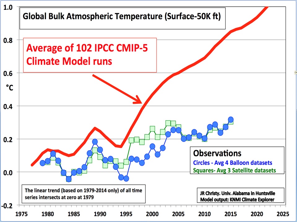
The latest IPCC report (as of 2017) is Assessment Report 5 (AR5) which includes 102 climate model predictions from CMIP-5. All but a couple of the models run "hot", meaning that the predicted temperatures are higher than what is observed. The blue and green data points are from measured temperatures from weather balloons and satellites, but we could as easily add in the surface temperature data set used in AR5 (the CRUTEM series) which would show the same divergence between measured temperature and predicted temperature. You can get more details on models vs. measured temperature at this post.
Something seems very fishy in Climate Science
This is where we stand regarding the historical record, the theory, the chemistry, and the predictive models. There is really quite a lot of evidence that climate science as currently practiced doesn't have as solid a grasp on the climate as they say. Indeed, at each stage we see quite a lot of hard evidence that contradicts what the so called "consensus view" of science is. If the theory were as strong as claimed, you'd expect to see the opposite - data everywhere confirming the theory.
For example, the highest temperature ever recorded in the United States was in 1913. After a century of positive forcing and year after year reported as "the hottest year ever", we find that the hottest day on record was over a century ago. Does this prove that the climate isn't warming? Of course not. However, if the science were as incontrovertible as we are told, you would expect a more recent record.
But let's look at what's going on in the "consensus climate establishment", because there are some very odd things that you see when you turn over some rocks. We will talk about some of these now.
ClimateGate and "Hide the Decline"
The University of East Anglia (UK) hosts the Hadley Centre for Climate Prediction and Research, one of the three most influential climate research organizations in the UK. The Hadley Centre is part of the UK Met (Meteorological) Office, the UK's national weather office. Hadley develops computer climate models and provides one of the most influential temperature data sets (CRUTEM3). In 2009, the Hadley Centre controversially refused a Freedom Of Information Act (FOIA) request for the CRUTEM3 raw (uncorrected) data.
Phil Jones is the current director of the Hadley Centre.
In November 2009, someone posted 61 MB of emails, computer program code, and climate data from Hadley servers to an FTP server on the Internet. One of the most notorious of the emails in this release was from Dr. Jones, and contained the following:
I've just completed Mike's Nature trick of adding in the real tempsLet's unpack this so you understand each piece. "Mike" refers to Dr. Michael Mann (of the Hockey Stick graph fame). "Nature" refers to Nature Magazine, one of (perhaps the) most prestigious scientific journals. More specifically, it refers to an article that they published, written by Dr. Mann in which he had a temperature reconstruction. There is a huge amount of dispute over what "trick" means - skeptics allege sleight of hand while Mann said it just referred to a mathematical technique. So what was the trick?
to each series for the last 20 years (ie from 1981 onwards) amd [sic] from
1961 for Keith's to hide the decline.
Dr. Mann's data sets contained many different proxy series. This is actually a good thing, because you want confirmation of results from different places and types of proxies (say, including ice cores, tree rings, and corals will probably be more reliable than just using tree rings). Mann's "trick" (call it a mathematical technique if you want) was to remove all proxy data later than 1960 and replace it with measured temperature data. The result was a hockey stick shaped temperature graph. This is what Dr. Jones did in the paper referred to in his email.
The $100,000 question is: why go to the trouble to do this if you have proxy data from 1960 up to the present? Why replace 50 years of perfectly good data?
Hide the decline.
This is a great, detailed video about ClimateGate and hide the decline by Dr. Richard Muller, head of climate science at the University of California at Berkeley. He is a high profile climate scientist and he has quite pungent things to say about Dr. Jones and company. The relevant part about Dr. Jones and the CRU starts around 29 minutes into the lecture.
There's more that I won't go into here (particularly the repeated modification of previously recorded temperature data with little or no justification) but this post is plenty long enough as it is and you have a solid grounding in the key points (with links to original sources so you can check my work).
10 comments:
Well done, and this is corroborated by some folks I know who work in the field... It's all about 'generating' the numbers they want. And it's VERY telling when an organization refuses to release raw data!!!
You need to put "quotation marks" around the "science" in the head.
Science it ain't.
This is a really well done summary, Borepatch. You should make it a permalink somewhere.
Thanks, Graybeard. It was a LOT of work. Not sure I'll update again.
This is well done Borepatch. It's enough to at least open some eyes. Sadly there are those out there that think all of this is Fake News or can be explained, like the CO2 reading in ice cores, or growth of one ice sheet vs another.
Well done and thank you!
Nicely done. Thanks!
More fodder for you:
https://www.wbur.org/onpoint/2019/05/29/trump-administration-climate-change-science-new-york-times
"Oh no! What if the administration introduced their own take on the science, then climate credibility will become adversely impacted."
Y'all already killed climate science credibility with the fraud you still haven't accounted for, discovered in 2008. Trump can't make it worse. And you are too blind to even recognize that.
And here I am in late 2019 reading this post and appreciating the work it must have taken to compose it. Thank you for the work and for making it available even today.
There has been a significant amount of new science that confirms the overall trend of earlier results. They are well summarized by NASA here:
https://climate.nasa.gov/scientific-consensus/
Post a Comment