Well, you'd expect wrong:
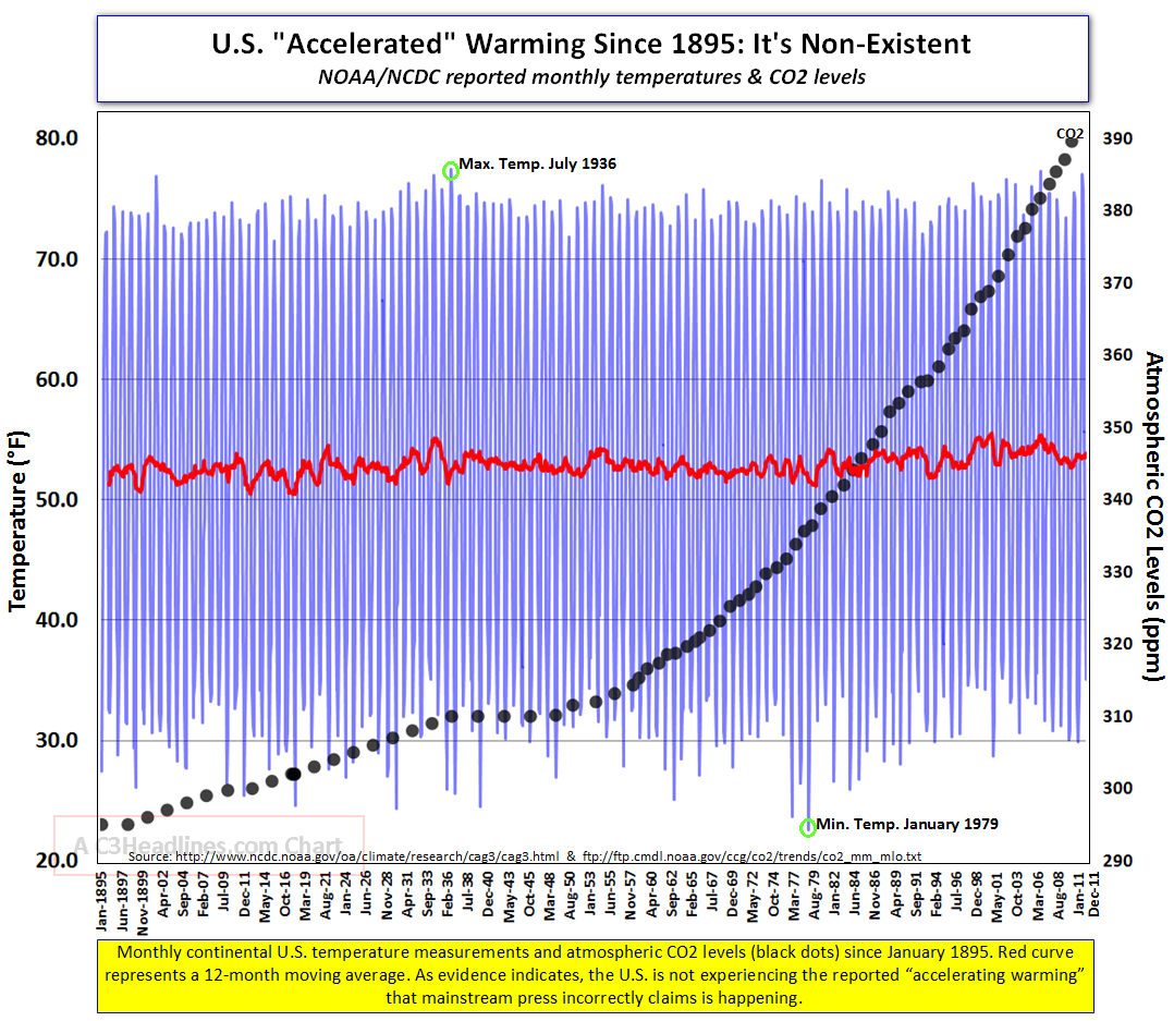
The blue bars show the high-low range for each month since 1895 (CONUS only). The red line is a 12 month weighted average of the blue ranges. The absolute highest range reported was July 1936, and the absolute lowest reported was January 1979 (green circles).
What this says is that the trend is essentially indistinguishable over almost 120 years. Quite frankly, this agrees with what the Fed.Gov itself says - 0.8°F over the course of the 20th Century. It agrees, of course, because it's the exact same data set.
Now here's the kicker: we're told that essentially all of this comes from greenhouse gas warming, mostly due to increased carbon dioxide. CO2 is plotted here in black - it's basically an exponential growth curve. You might even call it a hockey stick.
So here's the part that I don't get: there's been almost no change in temperature in 120 years, while CO2 concentration has increased by a third. So why all the talk about catastrophe if we don't do something RIGHT NOW DAMNIT? I'm struggling to understand the urgency.
Actually, that's a lie. I'm pretty sure that I understand the urgency of the folks pushing expensive, intrusive government schemes. I think I understand that just fine.
2 comments:
Yep, control and money... (and more regulations)
It always seems to boil down to those 2 things, doesn't it?
Post a Comment