Based on the data, there seems to be no relationship between lockdowns and lives saved. That’s remarkable, given that we know for sure that lockdowns have destroyed economies the world over.
Let's start with world wide figures. In the graph below the vertical axis is death rate per million population. The horizontal axis is the measure of the severity of the lockdown in that country:
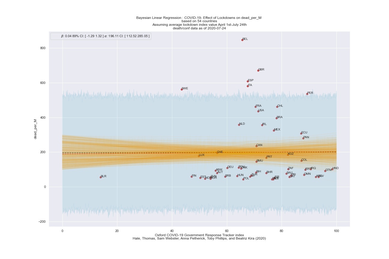
The dashed red line is the correlation (least square calculation). It's flat, meaning that there is no detectable correlation between death rate and lockdown severity. Now let's look at Western Europe:
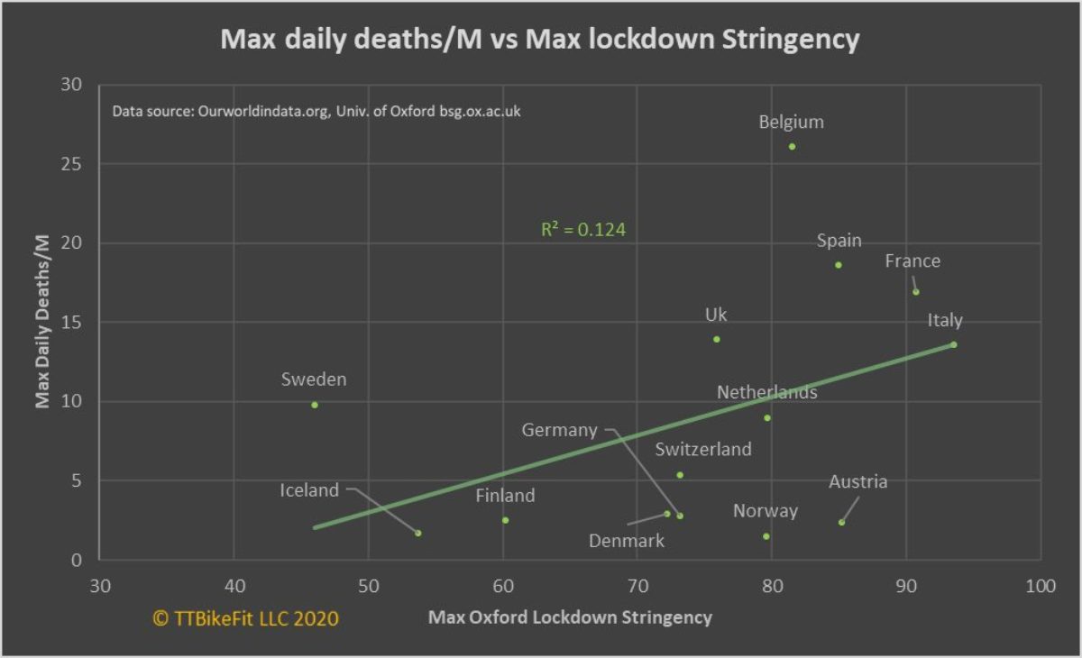
What's weird here is that there is a positive correlation, but it's backwards from what was promised by the governments: death rates are higher in countries that have more severe lockdowns. I have no idea what this means, but I do know that it doesn't show that lockdowns save lives.
Oh, and here are the US States:

The four colors are somewhat arbitrary but again illustrate the complete lack of correlation between lockdown severity and death rate. States in red had few shutdowns and experienced a high death rate; States in green had few shutdowns and experienced a low death rate; States in gray had severe shutdowns and experienced a high death rate; and States in blue had severe shutdowns and experienced low death rates.
It sure doesn't look like there's any correlation at all here.
Now with all the economic damage that's been done by the lockdowns, you would think that if the lockdowns were effective we'd be able to tell. Is it too much to ask that the "Science-based public policy" should actually be based on, you know - science?
Hat tip: YARGB.
Absolutely correct.
ReplyDeleteIt really works by stopping the transfer of the virus...
That requires people to stay away from each other. You
don't do that and any data that says separation and
quarantine is meaningless as that is the uncontrolled
parameter. Its only measuring the rate of acquisition
of the virus. Which only slows is contact continues.
If the isolation were complete we have to wait at least
one maybe two intervals (about 2weeks=1 interval) to
see the change.
After all the first month is those that had it blossoming
and those in the immediate area (family and house mates)
going though a cycle or two of transfer and illness.
This has been going on long enough to have a good picture of
contagious transfer.
Eck!
Because I'm looking for it, I'm puzzled that the "colored dot" graph doesn't show New York.
ReplyDeleteThey should be gray, severe shutdowns, high death rate. In deaths per 100,000 NY is #2 behind New Jersey at 168 deaths per 100K.
Florida, which they say is in the Red (lax restrictions, high death rate) has around 1/16 of New York's rate, 26/100K. So I don't really understand why Florida is considered a high death rate Red circle.
Both numbers as of 7/24.
Eck! the point wasn't to prevent the spread of the virus, it was to "flatten the curve" and prevent hospital ICUs from being overwhelmed by dying patients. It doesn't look like the social restrictions and economic shutdown did anything of the sort - there's no correlation at all on this. You would think if the shutdown was somehow effective you'd see *something*. You don't.
ReplyDeleteSiGraybeard, this is interesting - I had to look for NY. It's in the blue group (it's easier if you click through because the display is interactive there). It says that it had many restrictions and low death rate. That's not right at all.
So they did work... some.
ReplyDeleteTwo things is the overarching time line...
late january, houston we have a problem...many unknowns.
March its here, some knowns but treatment and severity
is mostly wild guess.
One thing not often marked is the start point for each region.'
NYC had it after the north west, boston/ma was several weeks
later to the same points.
So you need to take some clear marker and call that day one for
each areas so that curves are coincident. Deaths are easy.
Then the curves amplitude is then coincident with actions
taken to prevent it. Those that had it later had some data
as to what might work better, if they chose to implement.
The key feature is time of invocation. If say 1% of the people
have it and you lock down completely without people out in the
wind the curve needs up to 30 days to peak, and another 30 to
start the down trend. Some places tried to do that most didn't
bother or on words only. Some areas suffered from random pockets
of defiance so that furthers the diseases infectious agenda.
Why the long peak? People go home and some bring the bug there
and then pass it to the house and maybe apartment building.
Since the incubation times is 3-5 days you have that lag and
testing is 5 days sometimes longer to get results so your
maybe 10 days out before you know but you may also have
contacted 1-10 people.
Difference in death rate. There is a variation in the RNA
of covid-19 and there is some 7 or more variations. based
on the NYC sick there was higher prevalence of the italian
strain. Other places it was a different mix of the RNA
samples. Also NYC would be higher death rates as it was
new then and treatment was developmental. By late May
we had the poor results from Chloroquine, and Remdisiveir,
and Dexamethasone staring to be tried. By Florida we had
enough ventilation and new better treatments known to
work. That progresses to lower death rate for a given
infection rate. Not red or blue but time line.
NYC also was the first truely large city in the US hit
and NYC is very dense population wise. Any unchecked bug
there propagates fast and in numbers side consider the
10,000 to 15,000 people live in a 1sq block area. The
other is high density transportation.
The various meat/poultry/food packing houses are good study
of transmission. They are not red or blue, just dense.
All of the numbers have to have the event and the result
reduced to coinciding pairs and we do not have the data.
average time lapse is more than 8-10 days.
However prevalence data is very suggestive that its now both widespread and in the community. Without self isolation,
tracing, and quarantine you get growth in infection and
if its used to keep the sick and exposed in quarantine
you have a reducing population. However time critical
from when you know to when to quarantine. The later is
not being done much.
In all cases by time you presume/know its an issue your
5-10 days into a infection and then its all damage control
at best. We are testing but results lag greatly and those
positive are in any part of the disease cycle from just
barely active to maybe heading to gravely ill or in the
long tail of recovery.
As to blue or red, the key is did they actually lock down
or only close like all but essential. Any movement, travel,
or contact the experiment is not controlled and the data has
to be looked at differently to evaluate actual vs wishful.
I live in Mass, and we hammered it down and gradually opened
up and now the migration (beaches, resorts, and colleges) are
seeing the migration and clear pockets if infection with an
up tick in deaths.
Lots to look at but little to see with all the trees.
Eck!
Eck!, thank you for your information-rich comment.
ReplyDeleteBut if anything that just points out that there are many questions, and few answers. Given that, it seems inexcusable to lock down the economy and drive people out of work. At best it's flailing around by public health officials who are acting on hunches; at worst it's calculated to damage Trump supporters (especially small business owners) and reward big Democrat donors (Silicon Valley, Amazon, etc).
Like I said, I don't mind science-based public policy. I'd just like it to be science-based.
Too many missing variables to actually be a 'true' representation, and yes, NY should be grey.
ReplyDeleteActually, that schmoz nicely supports my theory that the Chinkypox is A scam, and one in which none of the perps can make their stories match. Either that, or there is a basic flaw in sampling, reporting, and data acquisition.
ReplyDeleteGiven the gravity and importance of the subject matter, and the supposed professionalism of the participants in these studies...inconsistencies like that indicate to me that criminal levels of incompetence and negligence are involved. The people claiming to draw meaningful conclusions from that dog’s breakfast are obviously morons trying to put on airs of intellectualism (Eck, call holding on line one), or panicky neurotics and hypochondriacs with doomsday fetishes (Aesop, call holding on line 2).
Those guys can be forgiven because you can’t fix stupid... but the medicos? They should be skinned alive for that mess. I read somewhere that those pin heads want the rabble to wear face shields and goggles now. It’s time to spank the stupid kids and put the adults back in charge...
I'll be blunt. I can cook the numbers to support any position.
ReplyDeleteThe maybe terrible and such of the lockdown is it wasn't a
quarantine for everyone and a largely wasted effort by
early opens.
I don't buy it as there is already to much confirmation bias
to make and answer that one. However what has been done seem
to have at least helped and we only have 157000 dead instead
of 250K or 600K. That in itself is a good thing. Its also the problem of buying time by slowing the growth.
As to closing vs economy. Its fairly simple if you die its no
longer an issue, you make nothing and buy nothing. If enough
die it can cause all sorts of unexpected side effects. Dead
don't vote, except in some towns they vote twice.
As to science based... when we have feelings and wichcraft
and bleach interjecting itself into conversation we are
already left science in the dust.
Confirmation bias... The economy has tanked. Must have
as my investments are doing very well. But people that need
work can't and the things they make are in short supply or
going unneeded or wanted. That will make a lot of people
desperate and feel abandoned, they will not know or care
about science as they don't have insurance and literally
can't afford to even get a cold. They have no jobs to go
back to and even if the job opens again it may not have
customers. The customer may not come back due to fear
or the feeling they were double screwed. Worse many of
those customers have no money as they had no job so we
are in for more crunch yet, open or not. It gets
circular from then. Its the big fear is going and
catching vs is that item being needed. No doubt buying
habits have changed.
So using old numbers with lots of assumptions to conclude
closing was a bad move is not science its just math. It
may be just bias that it was a bad thing. The outstanding
question is would have more died or not. Or its inverse,
would fewer have died if we [collective we] really did
something fully.
Or is dying a non-metric? Think of it this way 157000
deaths if we spent 50,000 dollars [doctors, machines,
hospital rooms elective surgeries not done and likely
no insurance for many] to try and keep them alive and
failed whos going to pay? Thats 8 billion out of the
economy and all shown for it is a body in a hole and a
lot of sick medical people. Then there are the ones that
recover but are need further treatment who pays and does
that enhance the economy. Seems to me its dying and long
term sick or disabled resulting do count.
Whats the calculous for that?
Eck!
I have issues with the four-colored graph, and I'd really like to see the numbers used to create it.
ReplyDeleteThe vertical axis is labeled "COVID19 Death Rate Ranking". That would seem to indicate that lower on the axis means higher death rates (#1 is a bad thing in that case). Or it could mean the opposite. The labeling is vague without that context.
But my bigger issue is that NY is in the same area as Alaska and Vermont on that graph.
NY has a very high death rate, ~8% for the whole state (according to CDC data), with a lot of cases. But AK and VT have very low death rates (AK's is below 1%), very low positivity rates, and very few cases. No matter how you're crunching those numbers, NY shouldn't be anywhere near AK and VT. But there they are on the graph, just a few ranks apart.
However, your overall point is correct: no correlation means at best, lockdowns had no discernible effect. At worst, the weak positive correlation on the second graph indicates they made have made things worse.
Lockdowns have unquestionably worked!
ReplyDeleteJust to what end?
Suppress the virus? Eh. Didn't work in nursing homes.
Suppress the economy? Force people to give up their rights?
Enforce submissive behavior?
Worked brilliantly.
Lies, damned lies, and statistics. But come on, this article isn't even trying...
ReplyDeleteLook at the chart for Europe. Lockdowns didn't come before deaths, they came after. Why are Italy, Spain and France at the top right? Because they were hard hit and imposed lockdowns as a result. Of course there is a correlation between deaths and lockdowns: the high death rates led to the lockdowns.
This article was written by someone with an agenda, who isn't even very good at misusing statistics.
Calling total BS on that graphic.
ReplyDelete50 yard penalty, loss of all downs, and expulsion from the playing field.
CA has 10M or so more people than NYFS, and has 1/8th to 1/10th the deaths. Whoever made that statistical abortion graphic clearly has a PhD in Common Core math.
This is the kind of kindergarten gobbledygook I expect from Alex Jones or Rachel Madcow. When you can see the b.s. hasn't even been dressed in scarecrow clothes before sticking it out in the cornfield, it's hardly worth the pointing and laughing. Good God, man, I'm fisking it from an ancient notepad with one hand tied behind my back. I'd have to be using a Commodore 64 with floppy disks, and be blind, to make this even sporting.
You're better than posting something this amateurish. It makes Rosie O'Fathead's 9/11 conspiracy-mongering look respectable by contrast.
You've been had by whoever posted the original clownish attempt on the interwebz.
Was it Solomon Odonkoh, perhaps?
😂
Stop. You're killing me. I haven't laughed this hard since 8PM PST on Election Night 2016.
Well, as a former co-worker once said, "Any data set can be tortured until it confesses".
ReplyDelete