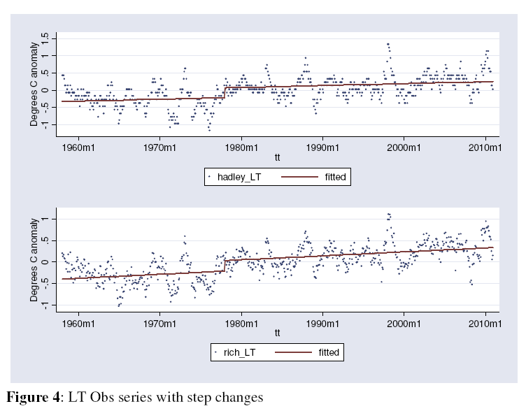
Both temperature databases show this same artifact, which may not be entirely surprising since both databases rely on the same station data.
So what happened in 1977? I must confess to being a little mystified here. However, this would certainly seem to complicate the link between Carbon Dioxide and temperature - CO2 has been increasing pretty steadily over this same time, so the graphs look very different. In other words, the correlation seems poor. Greenhouse theory is all well and good, but theory is empty if the data doesn't back it.
So what does all this mean? Beats me. All I can say is that if the Science were actually settled, we wouldn't keep running into mysteries like this.
14 comments:
Weren't we being warned about an impending ice age right about then?
In reality, none of it really matters. It'll get warmer. Or colder. Or whatever. Just like it always has done.
Star Wars, duh. :)
Interesting. Here in Ohio in 1977 we had the worst blizzard for a long time. There are still cold temperature records for the 70s standing in Cincinnati (including today, 34 - 1973).
No clue where that jump in temperature came from.
At the local (rural county) airport near where I used to live, they noticed a spike in daily summer temperatures *unexpectedly* one year. As it turned out, they had that spring installed a central air conditioning unit in the building next to the meterological station, with a 5 ton compressor/condensor within 6 feet of the thermometer.
Took them a few years to figure that out before they moved the weather sensors a few hundred feet further out and temperatures fell more into a 'normally expected' range.
I started dating my wife in 1977, just sayin'....
Vehicle emission standards.See, whenever the goob tries to fix it the opposite happens.
Jimmy Carter took office in 1977. All Jimmy's hot air, maybe?
PDO flip to warm phase.
One would think it had to be something with how they were gathering the data. If not, that's very, very strange.
I'm not sure exactly what it was, but I've read that that was the year the method of computing the data was changed.
In other words, not statistically meaningful, just an artifact from the way the data was presented.
Sort of like how the gooberment changes the CPI and employment statistics to make them seem better than they really are.
Don is pretty much correct. Weather stations measure air temperature a few feet off the ground. Satellite measurements measure ground temperature. While there is a loose correlation between the two, it is not perfect.
Satellite temperature measurements replaced ground based measurements, and no real effort was ever made to reconcile the differences.
Ground based weather stations in the few remaining pristine locations, some with records going back to the 1870's, show no long term warming trend.
But check Scotland's weather for an indication of where climate is going.
Stranger
I think it was some kind of temperature adjustment, you know, they needed to 'recalibrate' their equipment. The only people who really understand this step increase are the priests from the church of climastrology.
One wonders if there wasn't some collection point shift in 1977. Was that the year that they switched over to new, upgraded stations? Or newfangled measurement devices? Or added a whole bunch of stations to the mix? This info must be available to those who have access to it.
And as always, anytime you see a big inflection point in the data right around the time that your measurement sampling changed in some way, you must be very suspicious of that data change. Kind of like how the hockey stick graph's hockey stick started right as they switched over from bristlecone proxy data to actual temperature measurements from data stations...
A step-function change like that is certain to come from a change in how temperatures are logged or derived from secondary indicators, or as others noted above, due a change in the location where temps are recorded.
It's instrumental error, not natural change.
To track down the source, however, will require going back into the data that underlie the graph. I'm not going to bother.
Post a Comment